The Brotherhood - Logo Redesign! (UPDATED May 28)
THE FINAL:  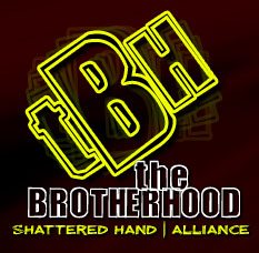 The original choices:  |
Down with logo 3!
|
#3
The others would be good if "The Brotherhood" was full of "brothas" that played Def Jam Vendetta or something. |
I kinda like the 1st one you made a long time ago:
 But thats just me... |
#3 is good.
But instead of the red backround... maybe try another color, or try a fade. just idea's. |
I vote #3.
|
I like 2 or 4. I would replace "online video gay community" with "PVP Shattered Hand" or something else (unless that was the intent lolwhut).
|
6, cause it looks like the A-Team logo and it doesn't have the fruity community slogan.
|
7 yo!
|
the whole online community thing is for when starcraft/wotlk/warhammer, and when we start organizing clans/guilds on other games. i dont want our experiences to die with just warcraft : ) i want us to migrate as a group of skilled players to other games. so seeing [tBh]Xane or [bhood]Xane in other first person shooters, gamer tags, etc. etc. Just my envisionment of the where "The Brotherhood" should be heading.
|
I think once you get the final say here you should take the top two logos and make another poll because people that picked the losers may choose the underdog. Did that make sense?
for example right now it would be logos 3 and 4. All of the people that voted for 1,2, 5-7 can get a chance to vote for just either 3 or 4 and the outcome may look different. just an idea. |
Logo for what? the banner? videos? #3 would be good for a video, but the current one is probably the best for a banner, maybe a different color.
Make something like this: (was the logo for my team tshirt :P) 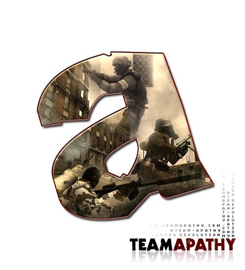 |
very cool Dale, something with a lowercase "b" or even "tbh" would look cool
|
just in case anyone's wondering why this pops as having a new post in the front page when there isn't... its when someone votes on the poll attached.
|
The idea about the gaming community is cool. I know I won't play wow forever, but I'll always be gaming and would be cool to stick around with the same players. I don't think it needs to be in the logo though. Just my two cents.
|
TBH i like them all....
The only thing I would like to see get changed would be the color. But, seriously if color is our only issue then I don't really see any problems. |
I voted for number 1. For some reason I thought number 3 looks like it stands for the Brian hood.
|
is that seriously your sig? i thought you were proposing it as a logo idea until i saw the little black bar across the top :P
|
In the famous words of Linda?More ideas you damn slacker!:p
|
Im with you chuck, lol
|
I would have to say #3 fo' sho'
less is better :) "Simplicity is the ultimate form of sophistication" - Leonardo Da Vinci |
3's not bad... I'm going to submit some logo ideas when I get time...
Nice stuff though, Xane. |
|
Those are nice, the spin effect on the "tbh" isn't necessary and kinda detracts from the look, IMO. I'm glad people voted on this one since the rest were filter and layer effect spamzors.
|
i didnt realize that beveling an object was photoshop filter spamming. ill keep it in mind next time king photoshop.
|
Woah, woah, woah. Relax.
And it's MISTER King Photoshop. but srsly, the logos are nice... |
| 12:24 AM GMT -5 |
Powered by vBulletin® Version 3.6.4
Copyright ©2000 - 2024, Jelsoft Enterprises Ltd.